MARIO’S ITALIAN EATERY | THE ENTRY
- tracywartmandesign
- Aug 26, 2020
- 3 min read

I recently posted about a super-fun project that I’m working on, which you can find right here. But as a quick recap, I’m working with soon-to-be local business owner [Mario Famularo] to fine tune the interiors of his new restaurant…Mario’s Italian Eatery.
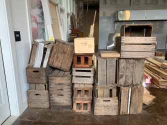
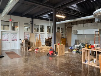
If someone asked me to assign a name to the future vibe of the place, I’d have to go with rustic meets eclectic/industrial with a touch of glam. There’s plenty of “rustic” with the wooden elements he’s created. Mario has put together shelves using reclaimed wood to house his array of Italian groceries. He also is using old crates for storage and display of goods. In addition, the place is set down in an old, industrial factory that was once a silk mill. With all of that working in his favor…it’s now my job to balance all of those cool details with other design elements to create an eye-pleasing space that is fun to either grab take-out or dine in with friends.
Here’s a few photos of what the place looks like currently and you may recognize a few of the photos from my post.


As someone who tends to mix and match different design styles, I’m loving the wooden aesthetic. But also as someone who feels a space needs a mixture of metals and finishes and color, my plan is to bring in a few unexpected touches that will be featured throughout this series of blog posts as we progress.
Today I want to focus on the entry. As you walk into the restaurant, you will be greeted with the seating along the right wall, as well as the counter with cases of meats and cheeses, etc. With the image of the reclaimed wood in the back of my head, I wanted to balance that rustic vibe with a more modern, clean/classic look. I gave Mario three different scenarios for the counter space as shown on the right side of the vision board below.

First option is to stay with the wood theme below the counter top, but couple it with a sleek marble-like top with bronze graining instead of grey. Second counter option would be to do black picture frame molding or wainscoting, but use a grey veined marble top. A third (out of the box) option is to use a fun tile with a butcher block counter top. You can see all three in the image above. Right now Mario is leaning towards option 2 – the black counter faces with white marble tops. Since the floor is a brown concrete, the black painted wood with white top will provide a neutral backdrop when displaying all of the fun goodies that he will have to offer.
In addition to the counter, there are a few other entry touches I want to talk about….
~ A wall-mounted butcher paper note roll – This would be a cool way to display daily specials, upcoming events, or anything…. maybe even a quote of the week. It adds a personal touch to a busy restaurant.
~ Plenty of live green plants and florals – Green plants are a must in every room, and I have a cool feature idea coming in a future post that ties in with greenery!
~ A large, gold, modern chandelier hung above the door to offset the other lighting we have planned (more on that to come).
~ A colorful rug to greet customers at the door to soften the industrial vibe and make them feel welcome and at home.
~ And a large menu board placed strategically that is done in a graphically-pleasing way for all to see!
I know I’ve said it before, but I am thrilled to be a part of this project! Seeing a space start with the bare bones and come together into something pretty spectacular is so exciting to me. This experience has inspired me to finally get my own design business started and in case you missed that announcement, you can read all about it here!
Stay tuned for more progress of Mario’s, including the seating area plan, cool bathroom ideas, and the feature I am MOST excited about!


Comments